Most homes already contain several wood colours before a new piece arrives. There may be an oak floor, a darker inherited cabinet and timber visible through an adjoining doorway. Trying to match them all can make buying furniture unnecessarily difficult. A more useful approach is to understand what each surface contributes, then decide where you want continuity and where a difference would give the room depth.
Read colour separately from lightness
Start with two observations: how light or dark is the wood, and what colour sits beneath that lightness? A pale board can lean honey-yellow, pinkish or grey. Two darker finishes can be quite different if one reads reddish and the other more neutral. Describing both qualities makes a discussion with a maker far more precise than asking for something that is simply warm.
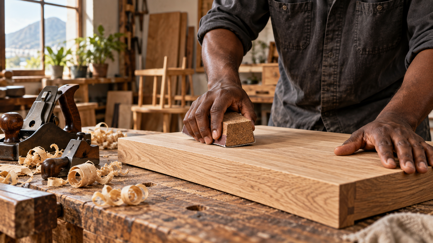
Species names are only part of the answer. Oak varies naturally, and a stain or finishing system can change its appearance substantially. Walnut is not one uniform brown either. Compare actual finished samples rather than expecting every product labelled with the same timber to look identical. The finish is part of the colour decision, not a detail to settle afterwards.
Take the largest surfaces seriously
Look first at the elements that are expensive or difficult to change. Flooring often occupies more visual space than any piece of furniture, while a wall of joinery may dominate the view from the entrance. Photograph the room from that entrance and note which timber surfaces you see together. A cabinet in a separate bedroom does not necessarily need to influence a dining-table decision.
Place a sample of the proposed furniture finish directly against the floor, then lift it to the height of the furniture. Light falls differently on a horizontal tabletop and a vertical cabinet front. If a close colour match looks slightly wrong, a clearer difference in lightness may be easier to live with. There is no obligation to make freestanding furniture disappear into the floor.
Give contrast a reason
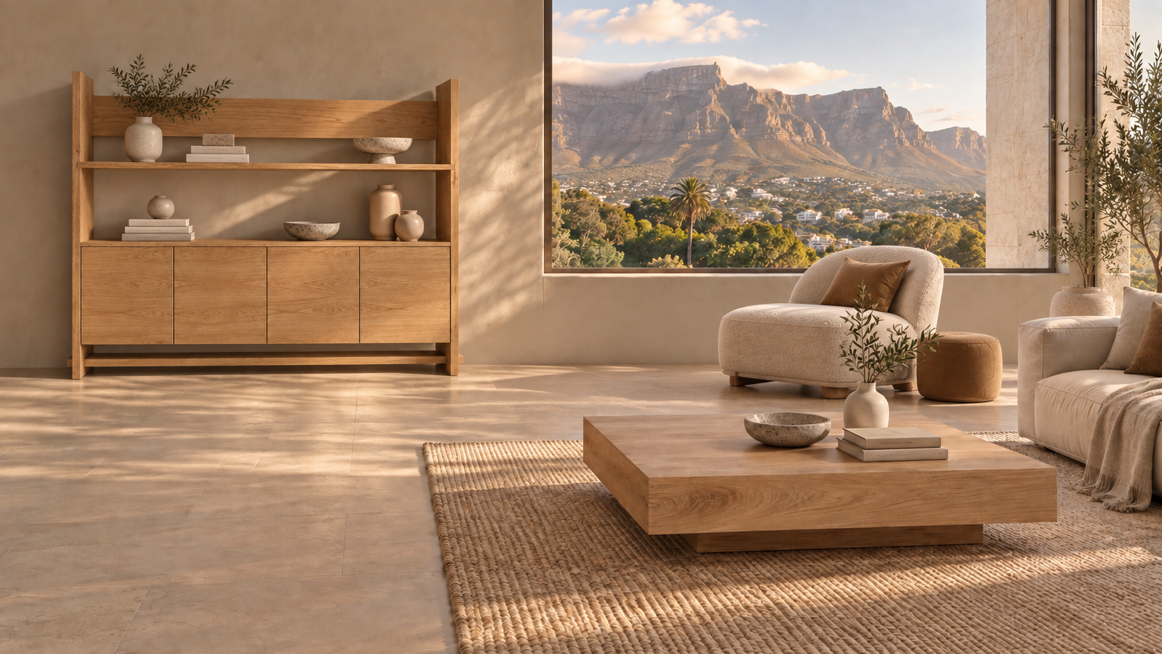
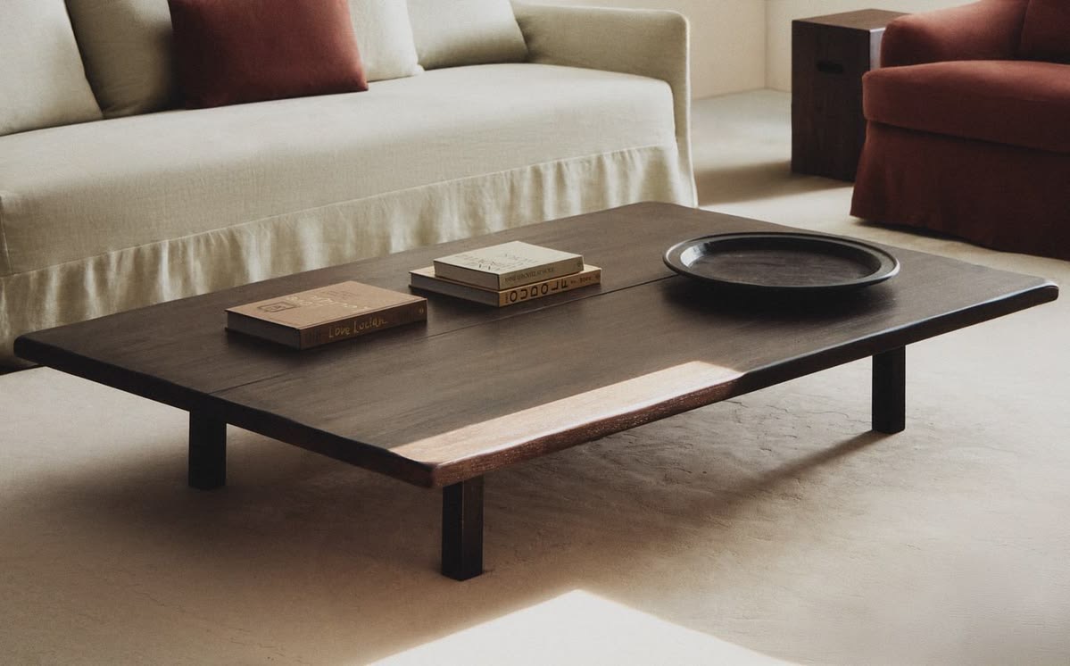
A darker coffee table can provide definition among pale seating and light timber. An oak sideboard can bring a gentler note to a room with a dark floor. The contrast works best when it supports the role of the piece: a central table may deserve attention, while storage along a wall may benefit from a quieter presence.
Repeat a colour where it feels natural, perhaps through a chair frame or a picture frame, but avoid buying small objects solely to justify one large piece. A room does not need a numerical formula of matching accents. Look instead at whether the darker or lighter elements feel reasonably distributed when you move between the main viewpoints.
Balance grain with texture
Colour is only one source of activity. A strongly figured tabletop, knotty boards and narrow slatted cabinetry can compete even when their tones are similar. If a favourite piece has expressive grain, give it some calmer neighbours. Broad plain cupboard fronts or a simpler table silhouette can allow that grain to remain the detail you notice.
Linen, wool, leather and woven surfaces offer a pause between timber elements. A rug can separate a wooden table from a wooden floor without disguising either. Choose it for the seating arrangement and daily use, rather than as a small patch under the table. Its texture and colour should make the whole group feel comfortable, including the chairs and sofa.
Make the decision in your own light
Keep samples in the room for several days. Compare them near the window, deeper inside and under the lamps you use at night. In Cape Town, a bright north-facing room and a shaded south-facing room can give the same finish very different emphasis. Phone photographs help record a comparison but are unreliable colour references because exposure and white balance change.
Finally, consider how much variation you welcome. A natural timber surface will not have the uniformity of a printed colour swatch. Ask what range of grain and tone is expected across a finished piece. Agreeing on that character is more valuable than approving one tiny, unusually even sample.
A finish chosen in context
When considering a VanSoul piece, bring photographs of your flooring and the furniture you intend to keep. Use the materials palette to begin the conversation, then confirm the finished timber against the room itself.
Explore materials